
LIND Pípari
Nobody browses for a plumber. They have water coming through a ceiling and about a minute of patience. The site has to do two things in that minute: look like a real company, and give them a way to make contact right now.
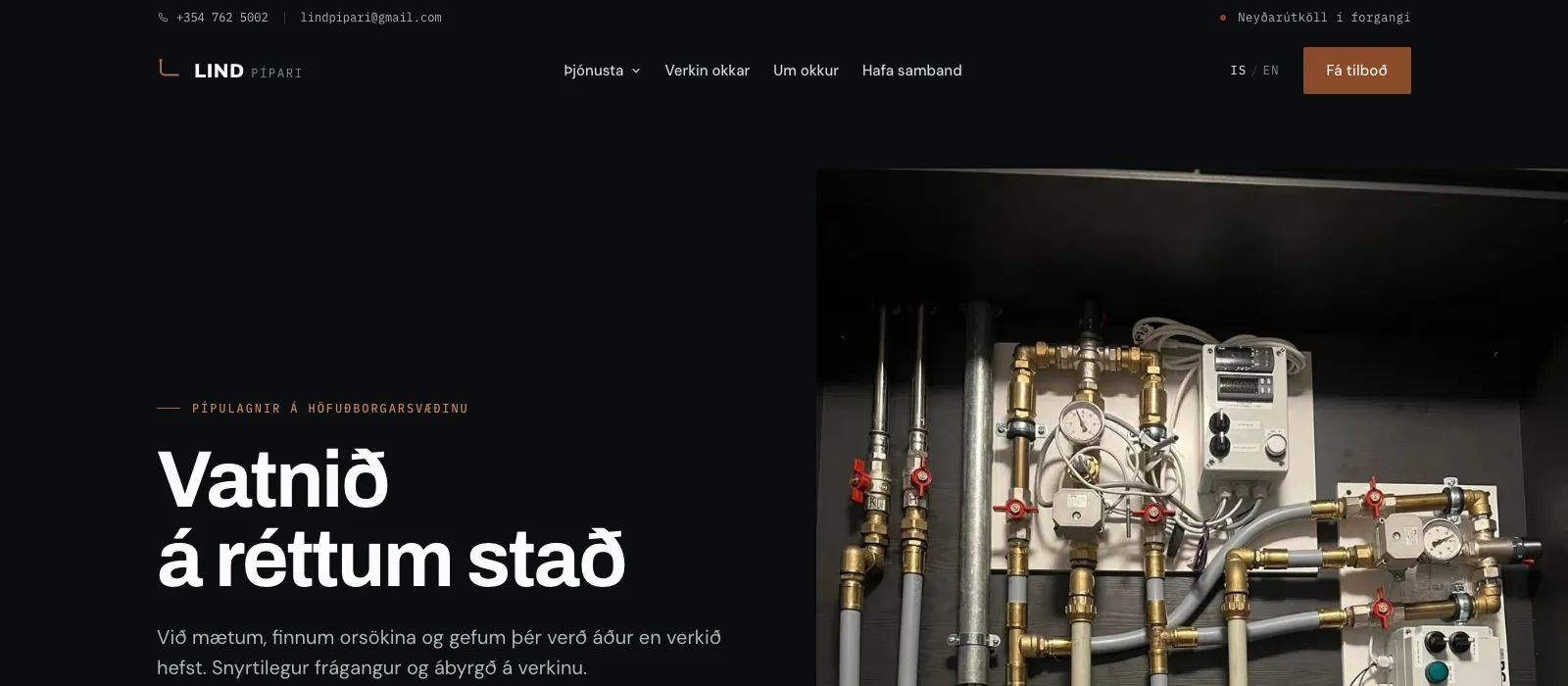
The problem
Trade websites tend to fail in the same two ways. They use stock photos of models in clean overalls, which nobody believes, and they bury the phone number under a contact form. Both cost the call.
What we did
Twenty two pages, one for every service and every area served, so someone searching for their own neighbourhood lands on a page about their own neighbourhood. Three ways to make contact on every page: phone, WhatsApp and email, because at eleven at night people reach for different ones. The service map is always on, never behind a click. No placeholder imagery anywhere.
Where it stands
The build passes strict mode and fails none of its automated checks across four browsers. We also took out every opening hours claim we could not stand behind, because a plumber who says they answer at midnight and does not is worse off than one who never said it.
- 22Pages
- 388Automated checks
- 4Browsers covered
- 0Placeholder images
Measured on the finished build.